IF you are like me, the first thing you notice when you walk into a room is COLOR.
How is it that some spaces are rendered beautifully whereas others appear to miss the mark?
Well, Designers have learned to take their cues from Nature.
Take a look at the flower. It's not just orange. It is layer upon layer of tones of orange; subtle shades which, when combined together, produce a visually appealing effect.
So it is with each of the Designer-rendered spaces in these thumbnails.
The Design Cartel members (we are a collaborative consortium who share projects, resources, ideas, and are dear friends) have carefully selected a color for the canvas of each space. They then artfully paired walls with an accent color. Sometimes the accent color is a favorite color and sometimes it is an existing piece which you just have to work with. Either way, it should pop!
Hint: repeat that accent color three times in your vignette. But be aware of that little orange flower. Don't repeat color in the exact tone nor in the exact same application; rather, have fun with it! Choose a silk, a velvet, a damask and then place it on a vase or lampshade or accessory: such as a pillow. You can change it out and save pennies doing so.
For instance, take a look at the loft which 'Brooklyn' designed. Notice the accent color is a burnt orange red. It is repeated no less than five times and that is because Theresa was working with an existing antique oriental rug. Look where and how she placed it in the loft.
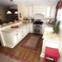
In Barbara Rose's client kitchen, she chose a raspberry red and had fun with it. Note hues in coordinating throw rugs, window treatments and the unique painted stool. It is a powerful color yet it pairs beautifully with canvas of cream whites. That is deliberate.
Adrienne chose a strong Ralph Lauren blue for the library walls. This might seem contra-intuitive, but she has a well-crafted plan. Adrienne balances it by introducing warm shades of tan. This color is repeated in EVERY item throughout the space. Right down to legs on antique green leather side chair.
In the final thumbnail, what you don't see is that I chose form over color. Yes, this is my design. I chose circles for living room installation. Artwork was the inspiration. The circles were repeated no less than three times in art, lamps and table top accessories. The color purposely neutral. Why? I'm all about minimalist...I love driving home the point :)
- theresedesigns's blog
- Log in to post comments


