
I recently had the pleasure of participating in an interview and photo shoot for Newsday’s LI Home cover page “How Big How High How Bright…Rule of Thumb for Room Décor” January 16, 2015 with my professional Design Cartel Colleague, Adrienne Kessel. (Adrienne Kessel Interiors, Port Jerfferson, NY)
We had a blast.
Why? Well, we got to spend the day together. That’s always a treat. I’m not quite sure how Adrienne pulls it off, but every time I arrive at her home (which is where this photo shoot took place), there is home-made baked bread fresh out of the oven waiting to be devoured. It’s to die for.
So here are a few simple tricks from the Trade when it comes to Designing that we’re happy to share with you.
2/3 to 1/3
Meaning: Consider your proportions. Parts of the whole should be spatially 1/3 to 2/3rds.
Examples:
- A coffee table should be about 2/3 the length of the sofa in front of which it’s placed
- An area rug that is in front of that sofa, can follow rule too
- Drapery panels along the sides of the window should be 1/3 width of window
The overall footprint of furnishings in a room should account for 2/3 floor space; leaving 1/3 open for negative space (curb your desire to clutter)
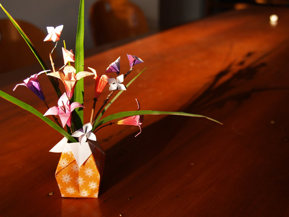
My favorite: Your vase should be about 1/3 the height of the flower arrangement
Rule of Three
It takes a minimum of 3 of anything to see the benefits
So create rhythm and pleasing flow around a room by partnering up Trios of 3s
This can be with accessories or artwork or color
Odd numbers in arrangements
Take queues from Mother Nature. Tie Color, Shape and Form together and do so in ODD numbers in a space
Legs and Lines
Be aware of the legs of your furniture. Make sure they are similar in tone, texture and shape and don’t fight with one another. Nothing worse than a hodge-podge of leggings. This is not the 1980s!
Shape Up
Do you have a favorite piece of Artwork in your Space? If so, look carefully. Is there a simple theme represented in the Art that you would like to expand on? If so, pay homage to that theme by incorporating that form in perhaps your lighting elements or accessories…be consistent with theme and repeat it. I did this in my living room with Circles.
Height
This is key. Your eye wants to “travel” around the room in one fluid motion. So be mindful of the height which you hang Art as it relates to window treatments, doorways and other structural elements in space
Mirrors
Use to reflect light – brighten up room
Use to reflect beautiful view: whether inside or outside of the space
Play with concept and consider incorporating backlit mirrors which serve dual purpose of light and drama
…and if you are still with me: My personal favorite:
“Less is More”
De-Clutter
By systematically “cleansing” your space, you not only free your home of clutter, you free your spirit from confusion.
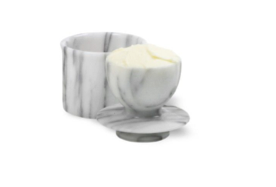
…In case you’re wondering, yes, Adrienne and I totally consumed the whole loaf of freshly baked bread. But this is why it is especially fun hanging out with creative Souls: Adrienne had an upside down marble butter keeper displayed prominently on her tablescape which she purchased while in Rome. I had a blast playing with it. Who knew butter would taste so much better when stored upside down?
- tbbcwd's blog
- Log in to post comments


